
https://www.polyflor.co.id/blog/2020/12/03/how-healthcare-interior-design-can-help-with-patients-recovery/
https://www.cbre.com/insights/articles/building-a-resilient-path-to-the-future
https://www-forbes-com.cdn.ampproject.org/c/s/www.forbes.com/sites/larryenglish/2020/11/06/should-companies-ditch-the-office-after-the-pandemic-is-over/amp/
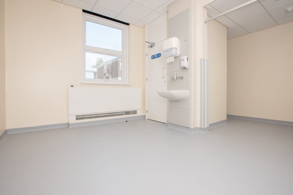
Colour aesthetics
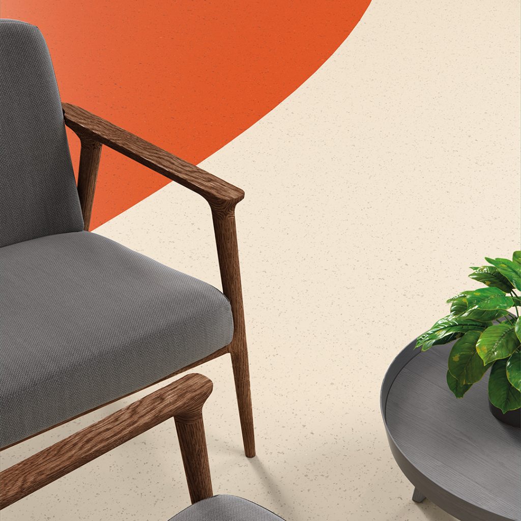
The colours in your healthcare interior can have a notable effect on how patients see and feel about your space. Traditionally, clinical interiors are only associated with a white palette. However, this is not considered a welcoming tone in healthcare settings anymore.
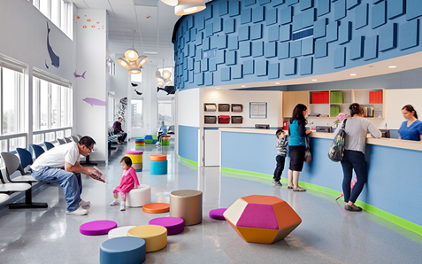
Now, it is more common to use different hues from the same colour or different accents to bring tranquillity and wayfinding into the healthcare settings. This can be a great way to provide a healing environment for the patients and improve overall outcomes.
Inspired by the natural environment and a world of colour, our Palettone PUR offers a palette of 50 contemporary colours, ranging from pale neutrals through to more intense shades.
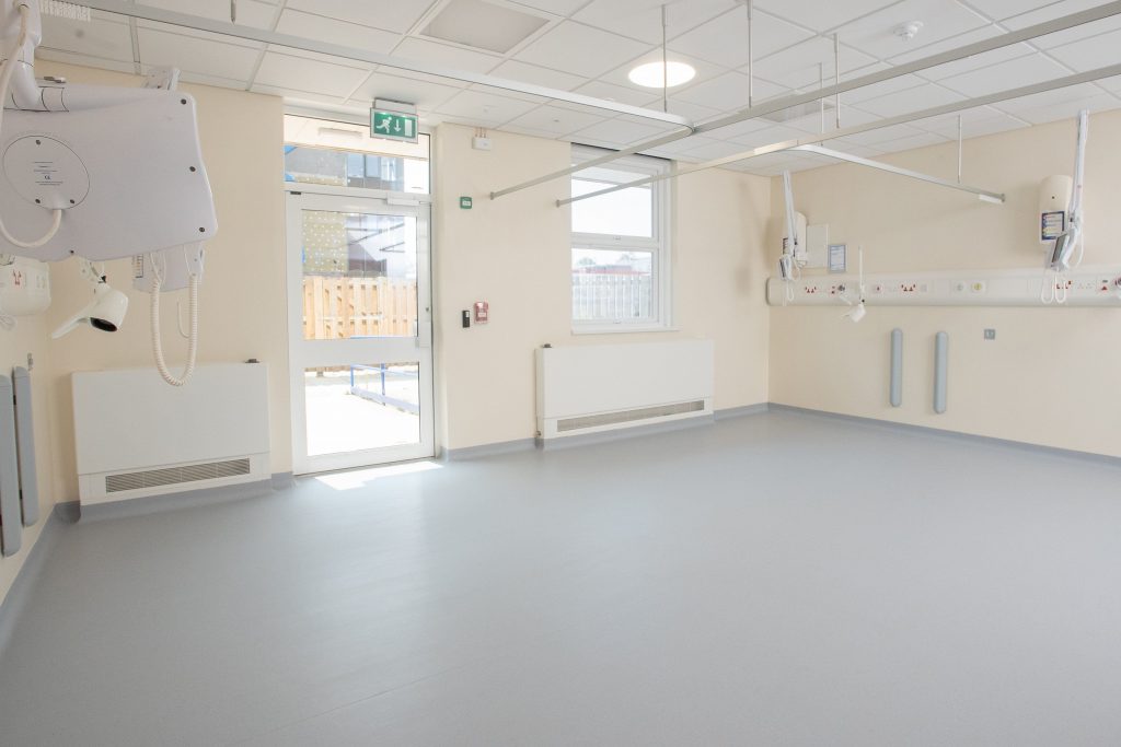
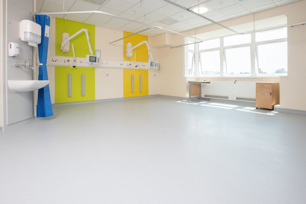
Shade: Frosted Glass 8606;Pencil Lead 8608
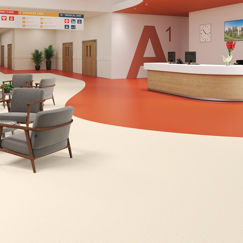
Shade: Cayenne Heat 8633: Harvest Air 8620
Palettone PUR features a solid colour base with complementary toned highlights. Each shade of this range has its’ own unique NCS reference for use as a guide whilst exploring bespoke design schemes.
Product: Palettone
Shade: Cool Blende 8636
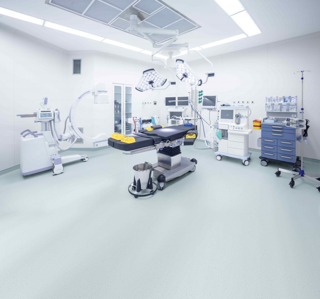
Within the health and care sector, Palettone combines performance with
aesthetics. When the issue of preventing and controlling infection is paramount
or when a subtle, tone-on-tone design is required for a dementia-led
environment, Palettone is the perfect fit-for-purpose contemporary floor
covering solution in any healthcare setting.
For colour. For choice. Think Palettone.
Shade: Weekend Sky 8611
